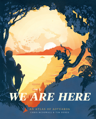
We Are Here: An atlas of Aotearoa was launched in Wellington on October 8 by Roger Smith, cartographer at Geographx Map Design Studio.
Tēnā koutou katoa. Greetings to lovers of books. Greetings to lovers of maps.
I’m Roger Smith, from the Geographx Map Design Studio.
I’m grateful to Chris McDowall and Nicola Legat, from Massey University Press, for the invitation they extended me to come along this evening and launch We Are Here. I’m very humbled, as I consider this book to be an exceptional piece of work and I’m proud to be associated with it.
I’m also very happy to find myself again in my favourite bookshop — so I’d also like to take this opportunity to throw a well-deserved bouquet to Unity Books — for doing what you do so consistently and so well.
Let’s talk about the book. We don’t see many new print atlases published these days. I have some personal regrets about that. Probably, like many of you, I have vivid memories of how atlases used to stir my imagination as a child; all those strange and exotic looking labels on the maps that promised so much adventure, and left me forever dreaming of heroic explorations in far-off lands.
The main reason of course why print atlases are now less common is simply that their reference and navigational functions are today delivered far more efficiently and effectively by digital media.
But print atlases have not gone away; they have flowered and followed new directions. Those that do see the light of day tend to be more ambitious in scope, they canvas a wider range of issues (societal issues in particular) and these tend to be covered in more depth.
They also give me the impression of having taken years to produce (and in most cases I’m sure they have) and they all seem determined to raise the bar with the quality of their graphic design (and in most cases they do).
The Bateman Historical Atlas (1997) was probably the first atlas of this type I became aware of. It broke new ground in New Zealand both in terms of content and design. It was followed by Russell Kirkpatrick’s Contemporary New Zealand Atlas (2005), with its own innovative take on content and design.
And now we have We Are Here, which in my opinion takes content and design to an altogether new level.
I mention content (or data) and design on purpose because these are areas where there is consistent growth and development. The sheer volume, diversity and availability of data today does provide a lot more options for content — we have so many choices today as to what information we include, map, analyse, or use to tease.
And advances in computer technology have similarly led to more powerful design tools and methodologies.
But map design or graphical design (call it what you will) of an atlas is so much more. It goes back to the purpose for producing the book, the conceptual development, thinking and framework. It covers the logic and methodology used to select content (you can’t include it all). It covers all aspects of your layout and presentation, the pointers, clues and subtleties you may choose to interweave throughout the book, and most of all (to my mind anyway) it is the skills that allow you to use graphics to effectively communicate spatial information and relationships to a lay audience.
Many of you will be familiar with the work of Edward Tufte, Emeritus Professor of Statistics and Computer Science at Yale. Tufte is an acknowledged expert in data visualisation. He is described by the New York Times as the ‘Leonardo da Vinci of Data’, and by Bloomberg as the ‘Galileo of Graphics’. Anyway, Tuft has a quote I like and which I think is appropriate here: ‘There is no such thing as information overload, only bad design.’
Believe me. There is no bad design in this book.
I do like the framework or layout used for We Are Here. The eight chapters follow logically: Te Whenua, Water and Air, Living Things, Places, People, Government, Movement and Energy, and, finally, Heart and Memory. (I confess I’m still getting my head around Heart and Memory — I think my generation tend to think of the 1980’s Crowded House music genre as Rock rather than Pop but then perhaps that just reflects how out of touch we have become. We all face the challenge of having to keep up!)
I also like the concept and execution of having contributed essays to introduce each new chapter. A nice touch that adds class. I like the ‘How to Read’ instructions elegantly appended to the bottom of each page. And I like the simple acknowledgement of source also provided for every spread, complimented as it is by the detailed 'Technical Notes and Data Sources' listed as Appendix 11.
Do I have favourite spreads? Yes, and I am quite happy to share them. For sheer simplicity and effective design: pages 40–41 — lightning strikes. For interesting content and visual presentation: p 202–203 — Māori vowels and consonants.
That is probably about all you want to hear from me. I congratulate Chris and Tim, and I hereby declare this book launched. I recommend you all buy copies. God bless all those who sail in her.